
In response to a couple requests, I decided to extend our recent comparisons of the NASDAQ and Shanghai Composite over a longer timeframe. It is, of course, arguable that the Shaghai Composite is a "bubble popping event" - we can only claim that sort of thing in retrospect. But in the present, we can say with confidence that it certainly 'looks like' the NASDAQ when technology stocks had all their issues in the 2000s.
Of course, figuring out 'when to start' this longer comparison is a tricky question - the longer we go, the less we can ignore inflation and dividends - so further away from our point of comparison we'll have a larger error due to those major factors. Also, too, companies are constantly entering and joining the markets - especially relevant since both markets had/have IPO issues. Also, too, we assume that bubbles have a start date - if they are a psychological phenomenon, there has to be a point where valuation starts getting out of line.
NASDAQ's 1310 Trading Days Before the 2000 Crash
We settled on 1310 trading days - not through some magic, but because it coincided with the first trading day of 1995 - January 3rd. That means our data set for the NASDAQ includes both the famous Irrational Exuberance speech (12/5/1996) by Alan Greenspan, as well as the date when our friend Ironman at Political Calculations showed valuation really went off the rails in the US (April 1997).
We extended the Shanghai Composite through July 16, so 23 trading days since the peak for both indices:
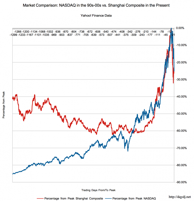
Eyeballing the chart, it does look like the comparison breaks down around 600 days before the peaks (Probably 2 1/4 years worth of trading days). Perhaps that can be explained by dividends or inflation - but remember, these are quick cuts we are trying not to complicate.
What Do You Think?
So I'll poll the readers - do you think the comparison holds up? Did the Shanghai Composite take a turn towards the overvalued maybe 200 trading days ago? Anything else interesting you can see in the graph?
