
We've been taking you on a fascinating journey through the IPUMS-CPS microdata lately as we dig up hard-to-find (okay, maybe just obscure) data on how the economy has been running in the last couple decades. Today we will continue the series, for data from 2008 - 2014.
Our most recent obsession, of course, has been "Income by Age" - or, specifically, "Total Resources by Age". That's right - we're trying to divine spending power.
Total Resources is a measure which tries to approximate the actual spending power of an individual using methodology aligning (but not mathcing) with the Census Bureau's work on supplemental poverty. Roughly, we remove taxes from total incomes, and add back credits, transfers, and benefits. Please see our initial piece for more detail.
Today we zoom in to how male incomes have done since the Great Recession - stay tuned for the female version.
Male Median Income Since the Recession
In our last piece on male incomes, our friend funny at Funny About Money asked about median income appearing to drop across many ages for males in the last couple of years. Now, note, our definition of "working population" is "anyone who worked 1 hour on average a week", so there will be some discrepancies with official measures - but by the time you reach the 'median' earner, most of the ouliers should be handled.
So, let's zoom into what funny was asking about:
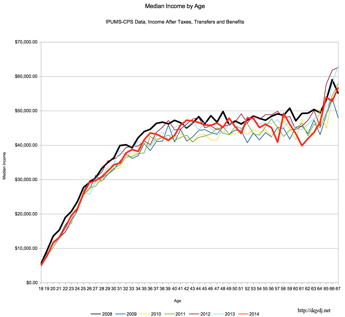
Another caveat: the year is "survey year", as in people were asked about the "previous year earnings". That means 2014 numbers are actually a respondent talking about 2013 - the survey happens in March, so it is 'conveniently' during tax season (leading, hopefully, to more accurate numbers).
90th Percentile Earners
The median earners look pretty bad, but the 90th percentile earners have held up better:
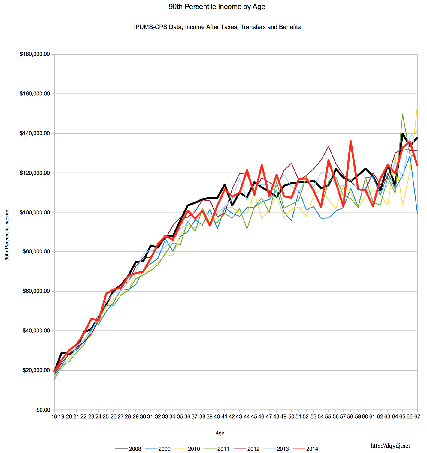
Of course, again, it does look like the 2012 (read: 2011) earner outperformed the 2014 earner for many of the ages above, but the recession years are safely below.
Sources
Miriam King, Steven Ruggles, J. Trent Alexander, Sarah Flood, Katie Genadek, Matthew B. Schroeder, Brandon Trampe, and Rebecca Vick. Integrated Public Use Microdata Series, Current Population Survey: Version 3.0. [Machine-readable database]. Minneapolis: University of Minnesota, 2010.
Larrimore, Jeff, Richard V. Burkhauser, Shuaizhang Feng, and Laura Zayatz. “Consistent Cell Means for Topcoded Incomes in the Public Use March CPS (1976-2007)”. Journal of Economic and Social Measurement 33(2/3): 89-128
Census Bureau revised income topcode files, accessed 5/13/2015.
Methodology
Same as in our article about the career income curve for 25 year olds starting in different years.
Conclusion
I'll let the charts speak mainly for themselves, but do you have any theories?
