
Dollar Cost Averaging (DCA) is oft-touted as the savior for all of investing's problems. Reality, on the other hand, is a bit different – in this post we'll show why lump sum investing usually beats dollar cost averaging when you have both options.
We'll use the S&P 500 in the United States as an example. (Skip ahead if you want to see math the typical difference between lump sum and dollar cost averaging.)
What is dollar cost averaging?
Dollar Cost Averaging (or DCA) is a style of investing where you automatically invest money on a regular interval. You buy more shares when prices are low, and fewer shares when prices are high. In essence, you bet on the average – hopefully DCA prevents you from terrible purchase times.
As a bonus, dollar cost averaging fits the general schedule of how people normally get paid. For example every two weeks you might get your paycheck, and also automatically invest in your 401(k). This is our suggested style of investing on a regular basis.
What is lump sum investing?
Lump sum investing is a style of investing where you have a large amount of money and you invest it all at once. Unlike dollar cost averaging, you don't slowly wade into the market... you make a big splash.
Lump sum investing is generally not applicable to your paycheck, whether it's weekly, bi-monthly, or some other regular schedule. It's more applicable to a windfall, which might include:
- Annual bonus
- Sale of equity (that you want to redeploy)
- Inheritance
- Tax return
- Sale of a house
- Sale of a business
- Any other one-off, non-repeatable money you receive
When is dollar cost averaging or lump sum investing better?
Dollar cost averaging is on average inferior to lump sum investing... when both options are available. That means if you have a large sum of money to invest, it's better to invest immediately than to slowly drip it into investments.
Usually, these large sums are called windfalls: large influxes of money you are prepared to invest. They might be from something in that above list or some other source. Whichever way, you now have a large amount of cash you'd like to invest.
When you have extra funds, you usually shouldn't tiptoe into the market. Instead, you should dive right in with a lump sum investment.
Don't believe me? The rest of the post will show you the math.
Lump Sum Investment Caveats
Mathematically, lump sum investing wins more than it loses... but sometimes it's more important to hedge the risk of a fall than to maximize your expected value.
But if you're younger, have more risk tolerance, or otherwise have a long time horizon – this tilts the game even more in lump sum's favor. Still: your situation may be similar, but remember you are unique.
Always consult a financial planner if you have doubts about implementing any investment strategy. This is not advice, and of course, past performance does not guarantee future results.
Calculating The Real Return on the S&P 500
We're using the S&P 500 index, a basket of 500 domestic stocks, as a representation of the total stock market in America. There are other options, but it is a commonly used proxy for the 'market' in the United States.
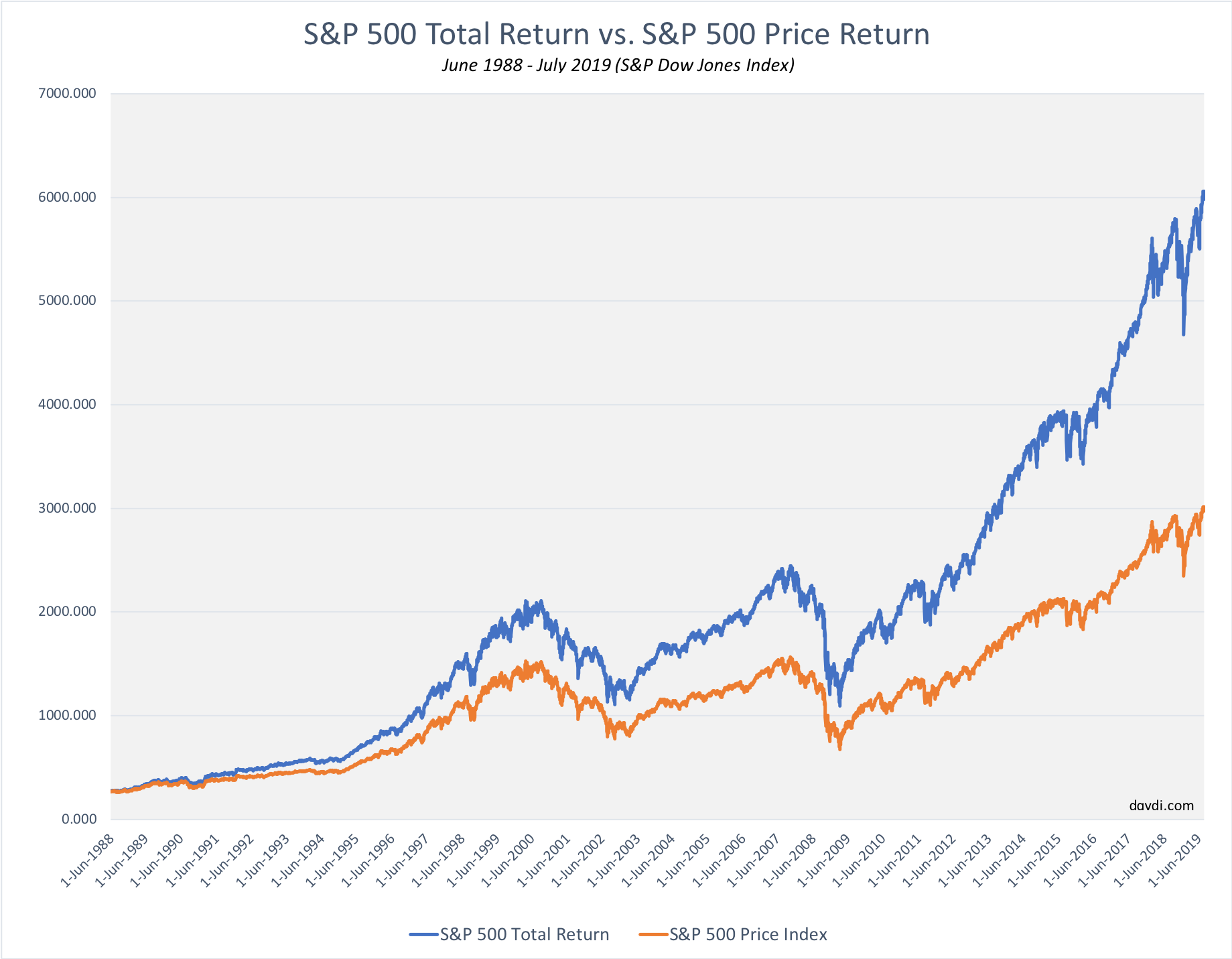
Above you can see a chart of the real price (in orange) that the S&P 500 closed at on the dates listed on the x-axis. The chart covers the period from mid-1989 to mid-2019.
In blue is the total return price, a made up value which includes the effects of dividends paid and reinvested. This reflects the (estimated) real return of the index, if you held the component stocks and reinvested dividends.
Using our S&P 500 total return calculator, you can see during the period from June 1988 - July 2019 the S&P 500 returned around 8% index level, and over 10% with dividends reinvested. The gap seems small, but that's the difference between 1000% and 2000% returns in that time-frame!
So, as you can see we need to take dividend reinvestment into consideration in this math.
Stock Return Drift Rate
It's true – past performance is no guarantee of future results. However, history does suggest that American stocks tend to increase. Your results may vary... for example look at recent history in Japan.
We like to call the bias for stock to move up and to the right the drift rate.
What is drift rate?
Drift rate or drift velocity is a borrowed term from physics and refers to the average velocity of charged particles – often electrons – in an electric field.
Electrons actually move in all directions, but when you have potential (voltage), electrons tend to move in the same direction. We look at stocks (or at least indexes) the same way: even though they move in all directions on a day, they tend to move up and to the right over time.
What is the daily drift rate of stocks?
On any average day since January 1871, US stocks have increased about .0239%. (Including non-market days and weekends, ignoring inflation adjustments)
Here's how we get that number:
- Use the S&P 500 Calculator from January 1871 to July 2019
- Grab the "Total S&P 500 Return" number: around 41,150,450% total return
- Calculate the number of days for 148.5 years: about 54,210 days
- Figure out the drift rate is ~ .0239% a day ( or ~9.09% a year)
Again, historic performance doesn't guarantee anything about the future. But: there has hitorically been minor upward pressure on US stock in aggregate.
Call it around .02-.025% daily.
Comparing Dollar Cost Averaging and Lump Sum Investing
Now that we have all the ingredients, let's finally put dollar cost averaging and lump sum investing head to head.
We'll assume a windfall of $10,000, and either invest it on the first day of the year or invest $192.31 every 7 days:
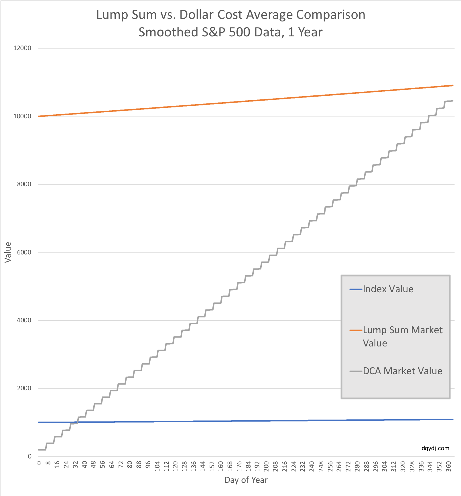
And there you have it – at historical average S&P 500 performance and weekly DCA, the dollar cost averaging strategy is $451.25 less after a year. That's essentially an annual insurance cost of 4.14% off the total potential.
Choosing the Right Investment Strategy
Obviously, this isn't a perfect simulation. Off our heads, it's missing:
- Inflation
- Interest on the DCA money held in cash while waiting to invest
- Taxes
- A lot more...
However, you can see that the normal drift rate of stock means lump sum investing is better when you have the option.
Dollar cost averaging matches well with your paycheck. For deploying a windfall, though, it will typically look like very expensive insurance.
That doesn't mean it's not worth it!
Perhaps you can sense – or are very fearful – the stock market will drop in the near future. Maybe it's psychologically easier for you to drip funds into investments than to throw everything in at once.
And sometimes in retrospect, DCA will come out on top when both options were available. However, the burden is on dollar cost averaging to prove it; the historical default – at least in the United States and most major economies – should be to prefer lump sum investments.
For more details in the real world, you can use our historical investment calculator on the S&P 500.
Enter a monthly average or set a large up-front value for an investment. You'll see that for a majority of time-frames, lump sum is better... but you can certainly find exceptions.
Takeaway: Lump Sum Usually Beats Dollar cost Averaging
Unless you have good reasons to believe there will be a market fall, or DCA is the only way for you to invest due to psychology... you should bias towards lump sum investing.
Have fun out there, and no matter which style you choose may your portfolio value always move up and to the right!
